TL;DR
The final capstone project of the Google UX Design Professional Certificate course. This project involved creating an app and a complementary responsive website design. This app allows users, bakery owners, to sell their unsold food in order to reduce food waste.
Role: UX Designer
Duration: March 2024 to June 2024.
Project overview
Product
Bakery Board is an app and responsive website that would allow bakery owners to sell unsold food in order to reduce food waste.
Problem
According to Move for Hunger and Business Insider, about 85% of unused food in American restaurants is thrown out, with only a small amount being recycled or donated (14.3% and 1.4%, respectively). With this new app, can users successfully post unsold items in the app?
Goal
Design an app and accompanying responsive website for bakeries that will allow users to easily post any unsold bakery items and reduce food waste.

Photo by Joe Shields on Unsplash
Understanding the user
User research
I conducted interviews with several people who have sold something using a platform, such as an app or a website. I wanted to determine what pain points users experienced and what they think is important when selling an item. After conducting interviews, I created an empathy map for each person I interviewed, then created aggregate empathy maps to better understand the types of users I would be designing for. I determined that users find the posting process to be annoying and cumbersome and that getting rid of items feels good, especially if they’re not going to waste.
Pain points
Time: Adding item information, such as adding a description and taking pictures can be cumbersome. Designs can incorporate a feature that will allow users to quickly add item information.
Sale logistics: Users don’t like the logistics of a sale, such as adding item information. Designs can incorporate the most important information when it comes to a sale or make it less annoying and cumbersome.
Personas
From the empathy maps, I then created two personas which I used to influence the app and website design. Meet Kibum Lee and Isabella Carrillo:

Kibum Lee
“I would hate for all of this delicious food to go to waste!”

User journeys
Kibum's user journey
For Kibum, I wanted to create a straightforward user flow that would allow him to post baked items he was unable to sell. I wanted to ensure that each step in the posting process would be easy to do and that he would be able to include the most important information when posting an item to sell.
Isabella's user journey
For Isabella, the user flow was similar to Kibum’s. However, I considered ways that she could quickly post an item. I wanted a feature that would take the manual work out of filling out forms so Isabella has more time to focus on creating and experimenting with new recipes.
Starting the design
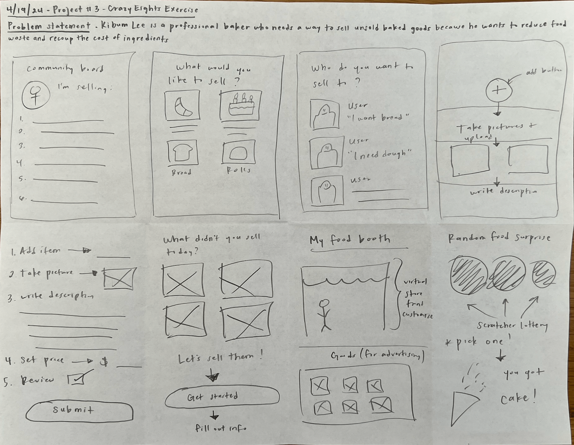
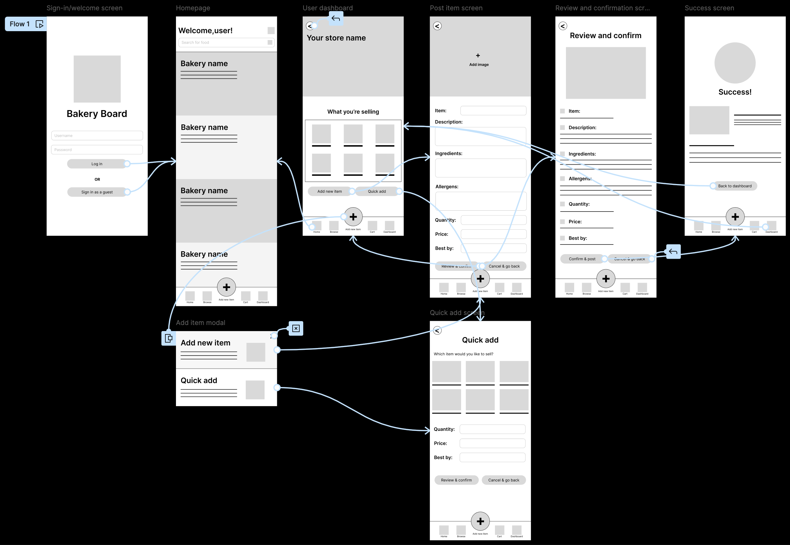
Paper wireframes
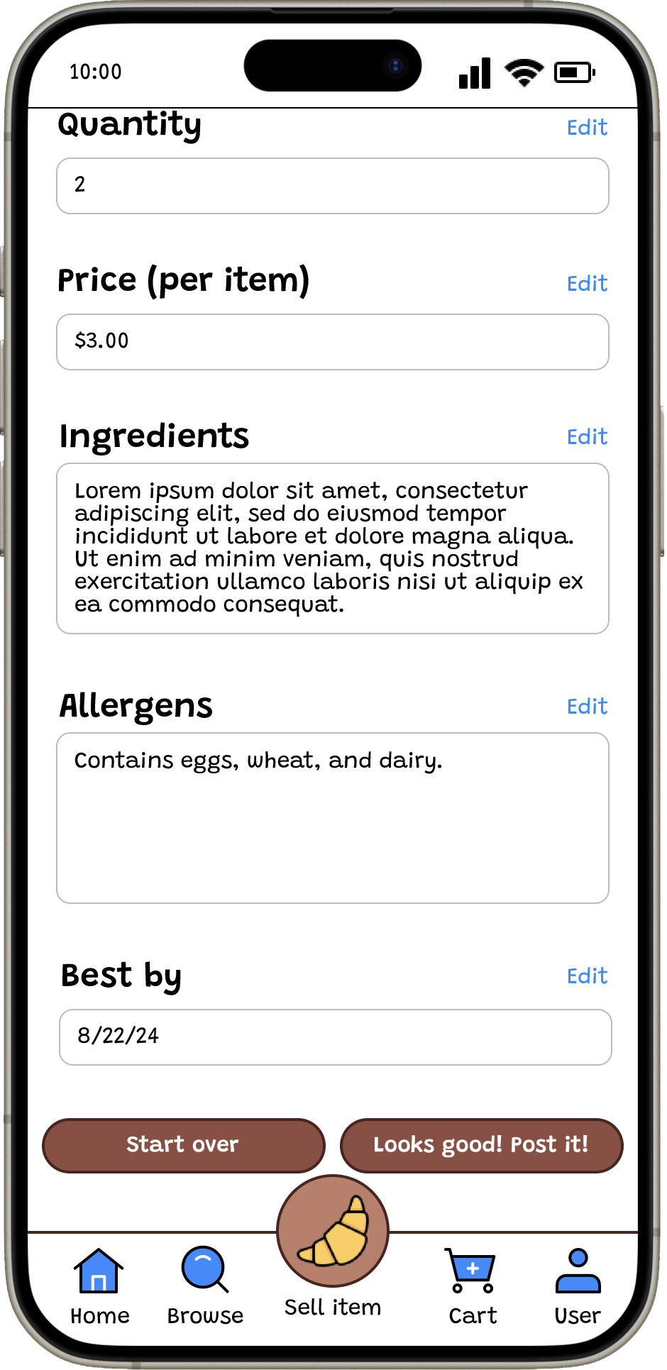
One of my goals was to present food information without making the app too cluttered, while also including the most important information. I also wanted to create a page where the seller can see what they’re selling and add new items.
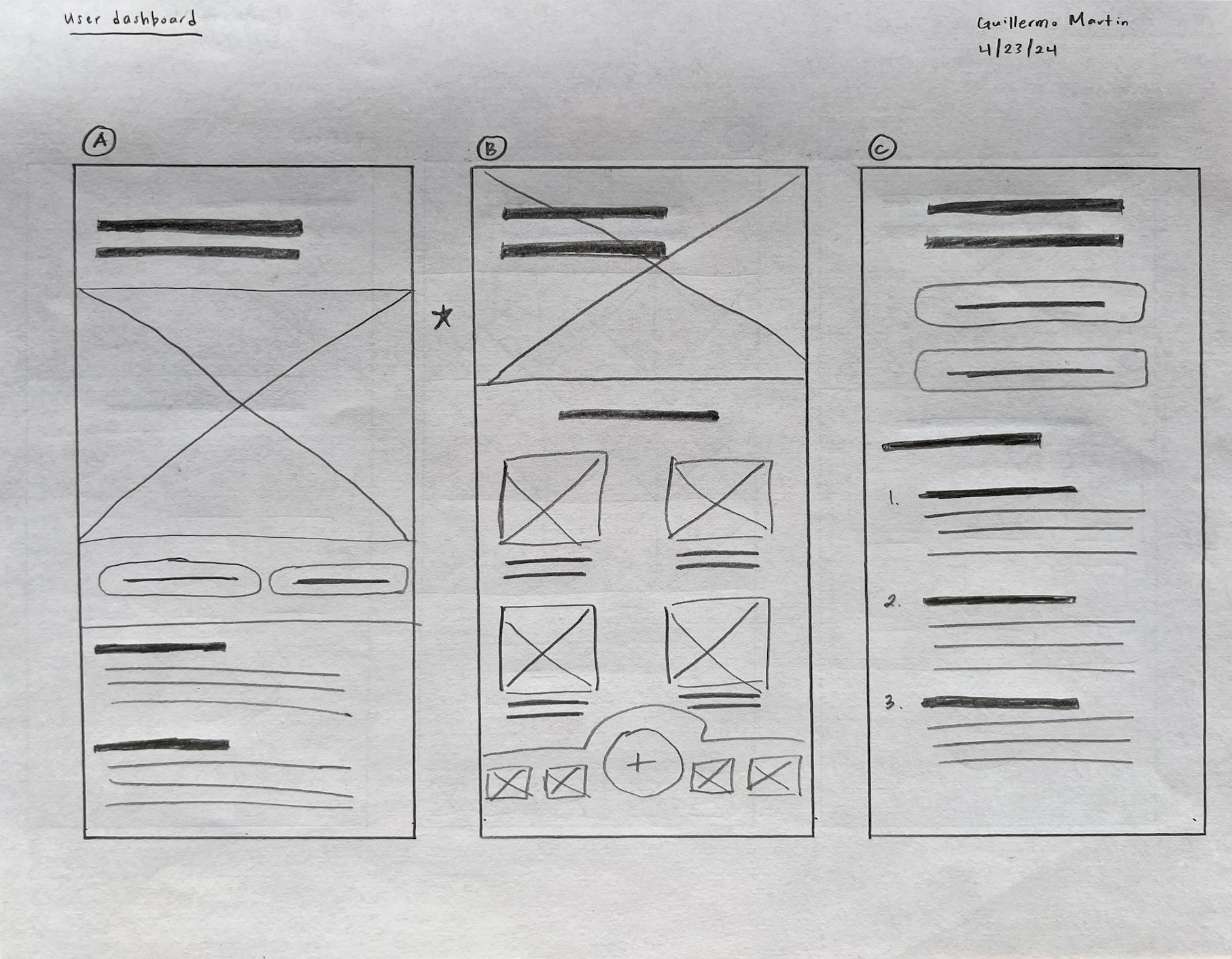
Digital wireframes
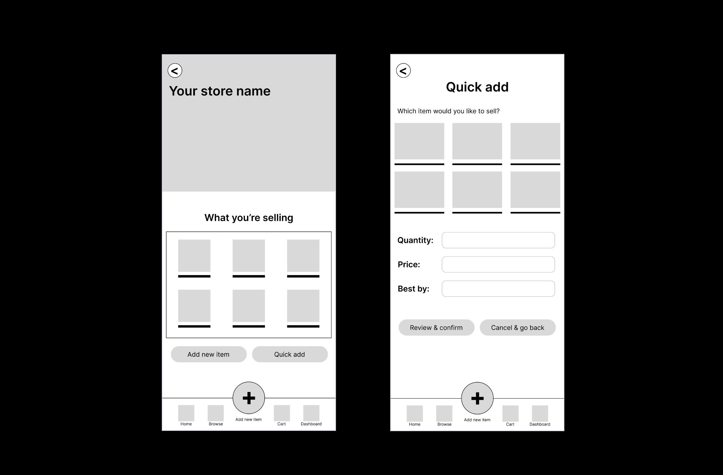
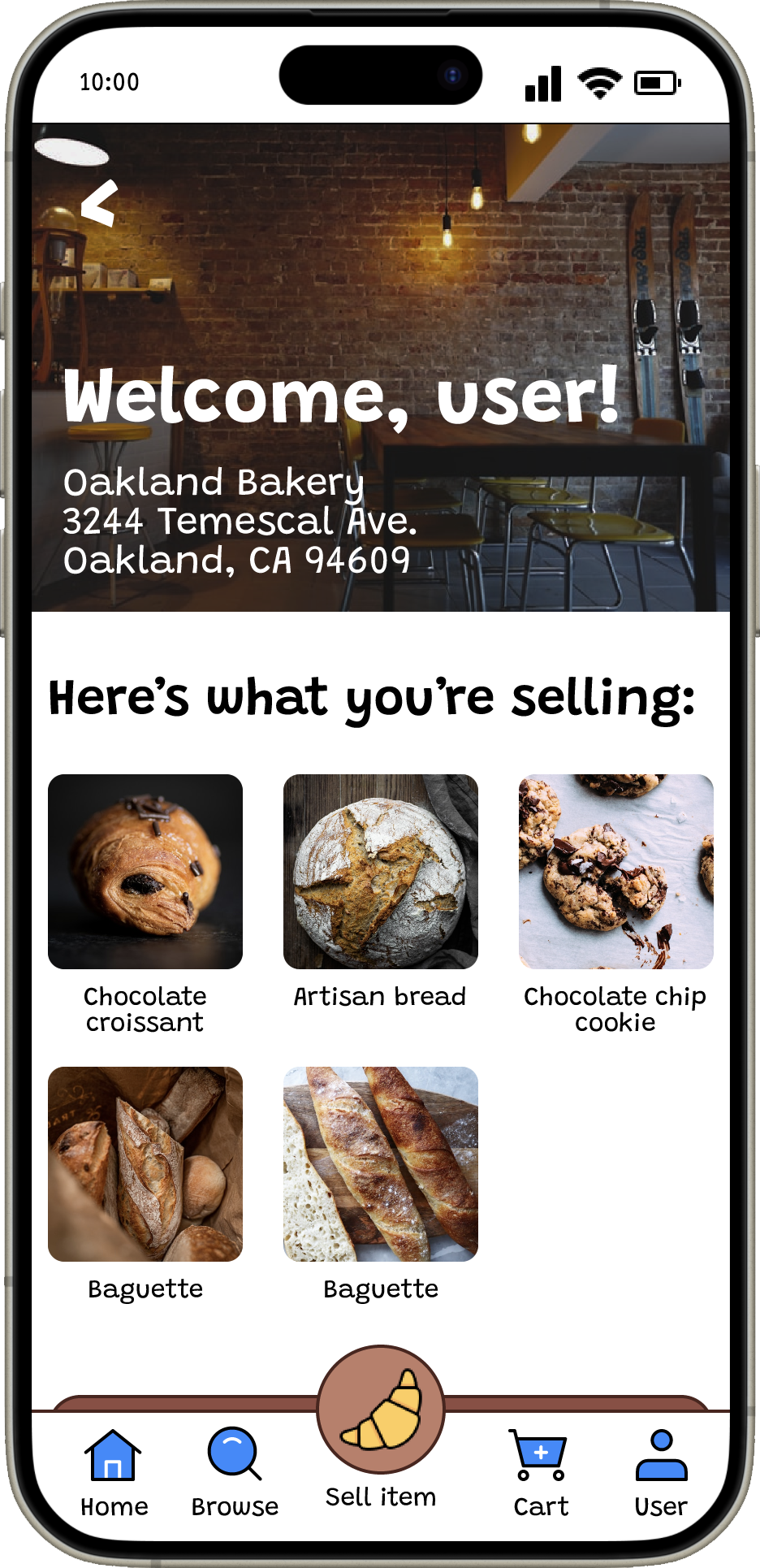
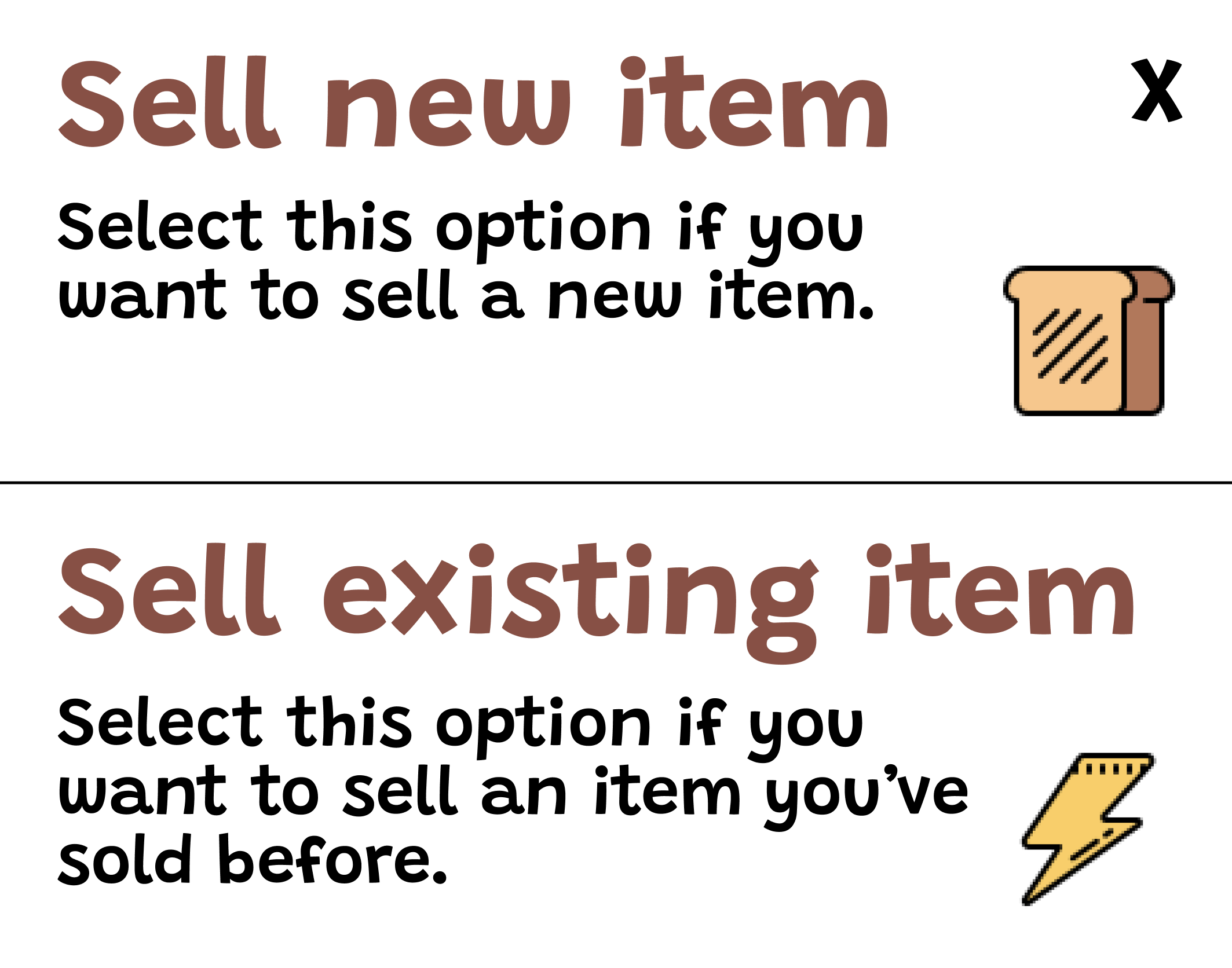
Using my paper wireframes as a reference, I created digital wireframes. One of my goals was to have a central hub where a seller can see what they’ve currently put up for sale and where the seller can add a new item. From my research, I found that inputting item information can be cumbersome. I wanted to create a way for users to quickly enter information. I created a “Quick add” screen that would allow users to sell items they’ve sold before.
Low-fidelity prototype
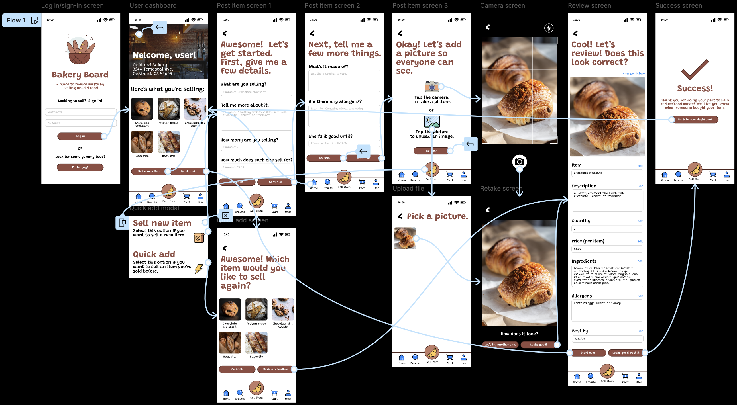
After creating digital wireframes of all of the screens, I created a low-fidelity prototype. The prototype features the primary user flow for a seller looking to sell their unsold items. The user can either sell a new item or sell an item they’ve previously sold in the past.
Usability study #1
The first usability study was conducted to determine if users can easily post an item using the app, if the “Quick add” feature saves the user time, determine what elements worked well, and identify any opportunities for improvement. Following the usability study, I created an affinity diagram in order to determine patterns, themes, and insights. Any findings were then used to create high-fidelity mockups. Here are the parameters of the first study:
Study type
Moderated usability study
Location
United States, remote
Participants
5 participants (between the ages of 25 and 72)
Length
30-45 minutes
Findings
Here were the main findings from this usability study:
Adding an item: Users were confused by the options regarding selling an item.
Font size: The small font size, especially in the bottom navbar made it difficult to read.
Homepage: Users were confused by the function of the homepage.
Photo by Firmbee.com on Unsplash
Refining the design
High-fidelity mockups and prototype
Mockups #1 (mobile) - Font size
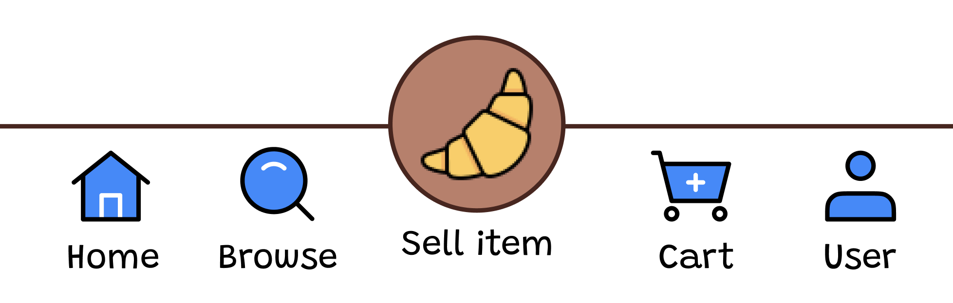
Based on the feedback I received, I decided to implement the most important changes first. The first thing I did, was increase the size of the font in the footer to make it easier to read.
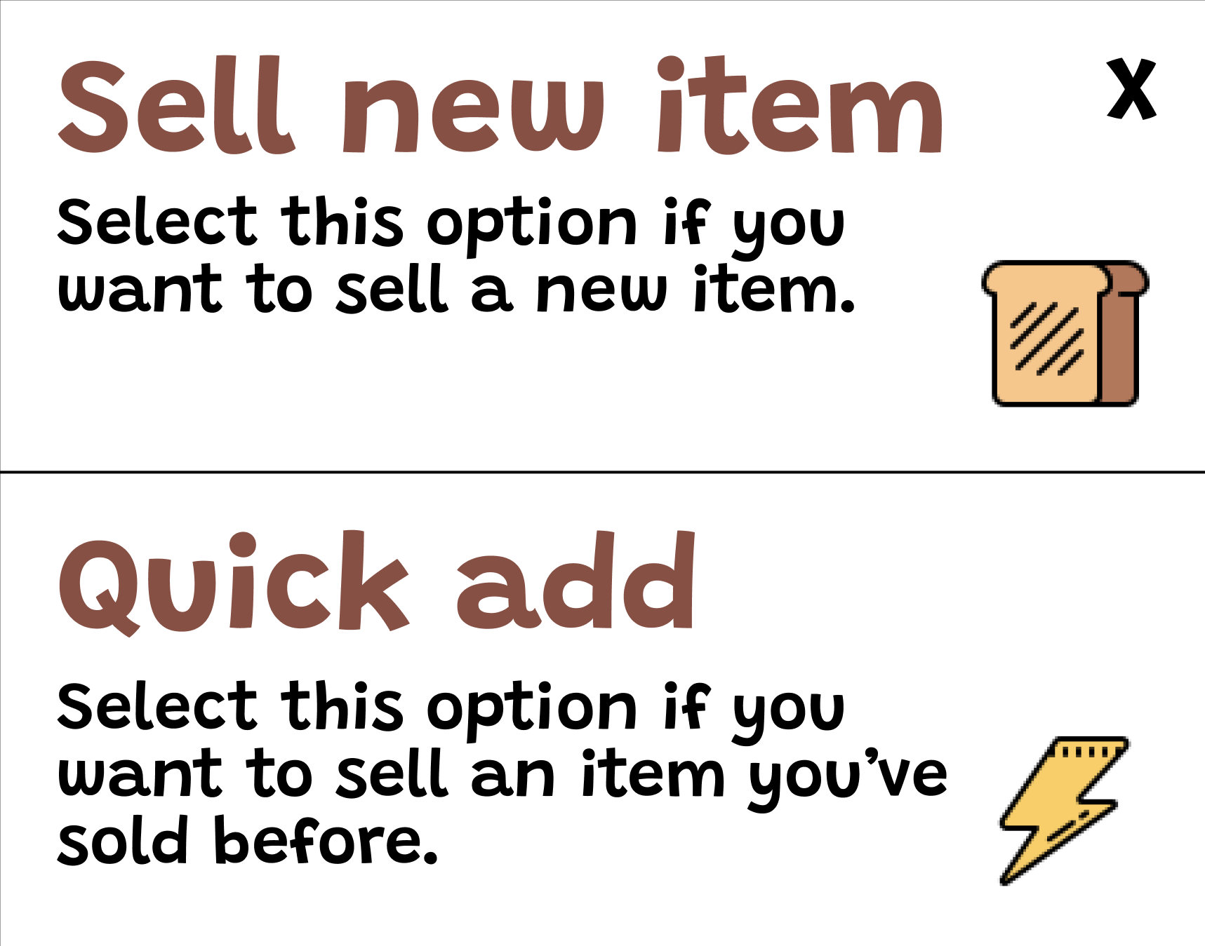
Mockups #1 (mobile) - Clearer language
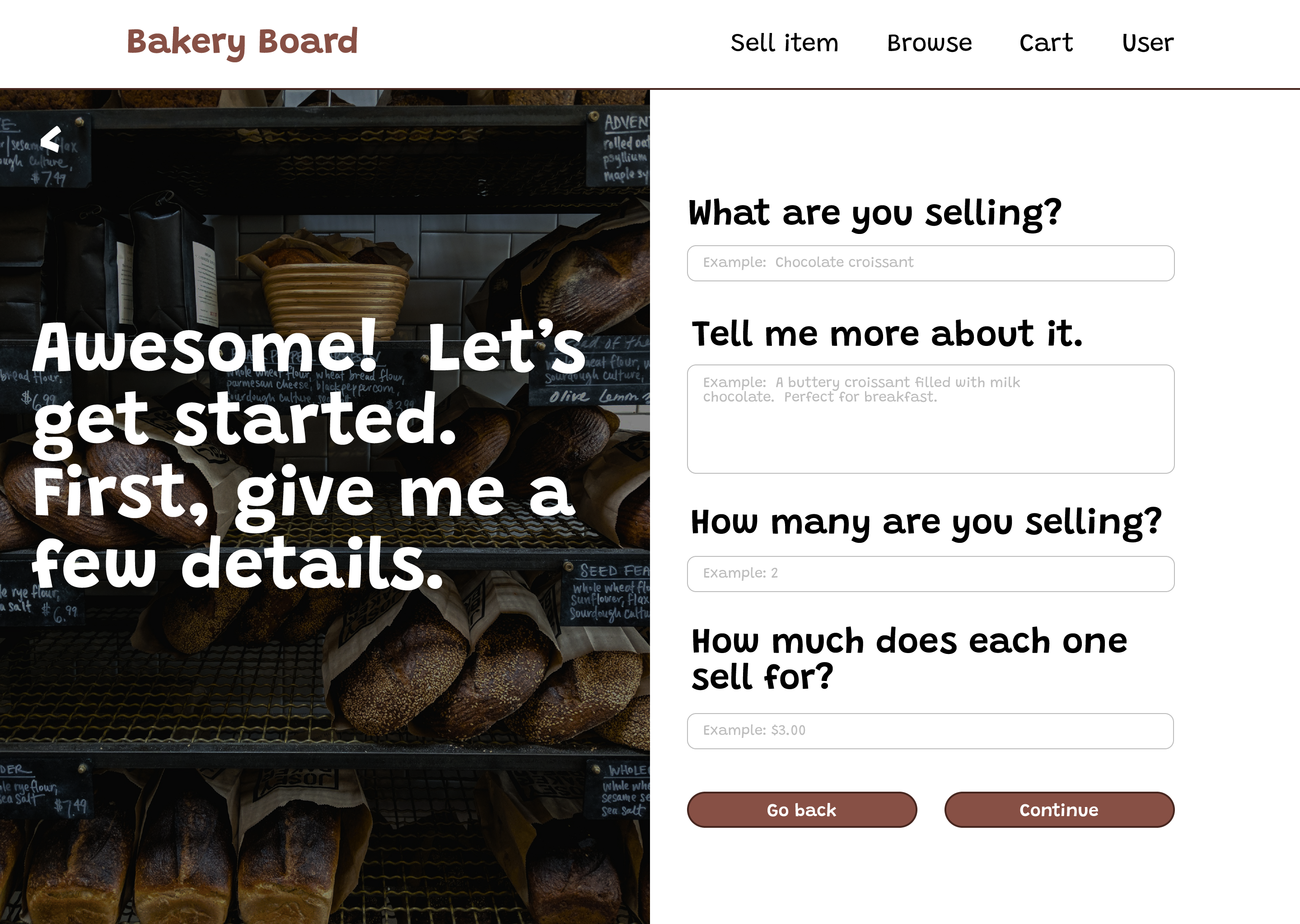
To make selling a new item more clear, I revised the language of the buttons and the modal. I also added a short explanation for the options in the modal.
Mockups #1 (mobile) - Homepage
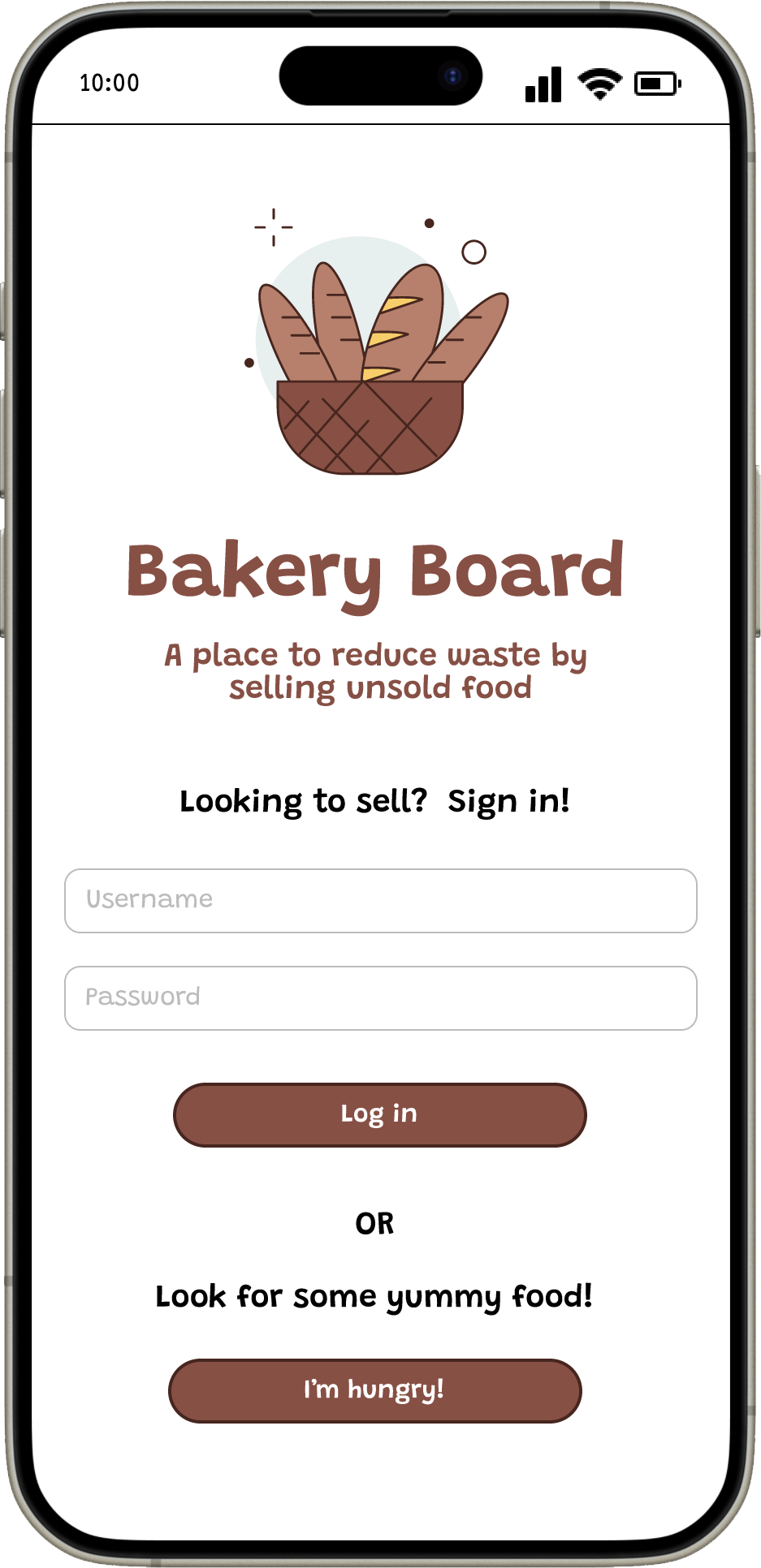
Finally, for the homepage, instead of a list of bakeries (which was aimed towards users who were buying), I used the user dashboard as the homepage, keeping my user, the seller, in mind.
Mockups #1 - Desktop
When creating the complementary responsive website for this app, I decided to add a large image on the left side of the screen and the elements to interact with on the right side. I thought this was a great way to utilize the larger area while also keeping the user focused on the task at hand.
High-fidelity prototype #1
After conducting the first usability study, I refined the designs and created a high-fidelity prototype, implementing what I learned from the first usability study. The user flow included clearer language and larger font. It also follows the same user flow as the low-fidelity prototype.
Usability study #2
For the second usability study, participants were asked to perform tasks using the mobile high-fidelity prototype. This usability study was conducted to determine if the implemented changes made it easier for a user to post an item on the platform, determine what elements worked well, and identify any opportunities for refining the design. It also was conducted to determine if the new sequential user flow for posting an item makes the posting process easier. An affinity diagram was created to determine patterns, themes, and insights, which were then used to further refine the design. Here are a few details of the study:
Study type
Moderated usability study
Location
United States, remote
Participants
5 participants (between the ages of 25 and 72)
Length
30-45 minutes
Findings
Here were the main findings from this usability study:
User dashboard: Users were confused by the options regarding selling an item.
Navigation: Users were confused in some way by the navigation.
Quick add: The “Quick add” feature isn’t clear to some users.
Branding and theme: The color scheme and theme appeals to users.
Refined high-fidelity mockups and prototype #2
Mockups #2 (mobile) - User dashboard
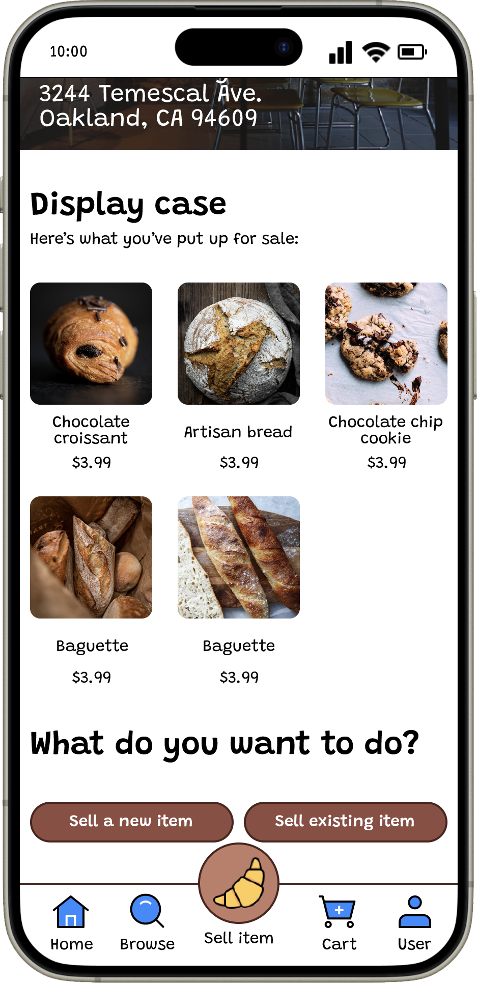
Based on the feedback I received, I revised the user dashboard to include clearer language so its function is more obvious to users.
Mockups #2 (mobile) - Easier navigation
I revised certain buttons to allow for easier navigation and so navigation flows more logically. The "Start over" button now goes to the user dashboard screen instead of the form.
Mockups #2 (mobile) - Quick add
I changed the wording for the quick add feature in the modal and on the button to make it easier for a user to understand.
Accessibility considerations
Here are a few things I considered when refining the designs:
Visual hierarchy: I used different sized headings to highlight important information and create visual hierarchy.
Readability: I increased the font size, especially in the app’s bottom navbar to ensure that it’s readable even on small screens.
Color combinations: I checked that the colors I was using for text met WCAG’s minimum contrast ratio using the WebAIM Contrast Checker.
Photo by Heather Wilde on Unsplash
Moving forward
Takeaways
Impact
Overall, users thought the app was straightforward, easy to use, and visually pleasing. Here's what a few participants said:
“It’s straightforward and easy to navigate, each field gives you [an] example of what to type…it’s pretty good.” - Participant A
“The interface is nice...It’s visually appealing.” [referring to the user dashboard] - Participant E
What I learned
Throughout this project I learned the importance of using a persona. I had two user journeys that were very similar, but with the personas in mind, it helped me focus on creating the design for the app. I also learned about the importance of different perspectives. I had participants who weren’t as technologically proficient, but still provided very useful feedback.
Final designs
Click the buttons below to see the final designs for both the mobile app and the desktop site!
Thank you!
Phew! That was a journey wasn't it? Thank you for taking the time to go through this case study. If you’d like to learn more or want to connect with me, my email and LinkedIn are listed below: