TL;DR
With Kumiko Music’s previous design, users encountered navigational challenges and were confused by the layout and different designs throughout the site. The new designs incorporated a top navbar, consistent styles and layout, and utilized typographical hierarchy and white space to make it easier for visitors to find information and learn more about Kumiko and her work.
Client: Kumiko Uyeda
Role: UX Designer
Duration: October 2024 (4 weeks)
Project overview
Product
A redesigned website for Kumiko Uyeda, a local pianist, composer, and ethnomusicologist that would allow visitors to learn more about her.
Problem
The site had navigational challenges and an inconsistent design, which made finding information difficult.
Goal
Redesign the site so it looks more professional and elegant, and to make it easier for visitors to navigate around the site.

Photo by Joe Shields on Unsplash
Understanding the user
User research
I first conducted a website audit, listing my observations, pain points, and potential improvements for each page of the site. Using the existing site, I conducted a usability study with several users to identify pain points and opportunities for improvement. After conducting the studies, I created an affinity diagram to determine user pain points. Then from these pain points, I created two user personas that I would use to inform my redesign.
Pain points
Navigation: Users were confused by navigation. Adding in a navbar can make it easier for user to navigate around the site and find what they’re looking for.
Design: There weren’t any cohesiveness between pages. Creating a consistent design across all pages will provide cohesiveness throughout the site.
Layouts: The layout of information was inconsistent. Laying out elements in a more organized fashion can help users find what they’re looking for.
Personas
To help with the new design, I created some personas. Meet Shawn Watts and Louella Washington:

Shawn Watts
“I want to learn more about this new, musician but the website made it difficult to do so.”

Louella Washington
“I’d like to listen more of this musician’s music, but I’m having a hard time finding where.”
Starting the design
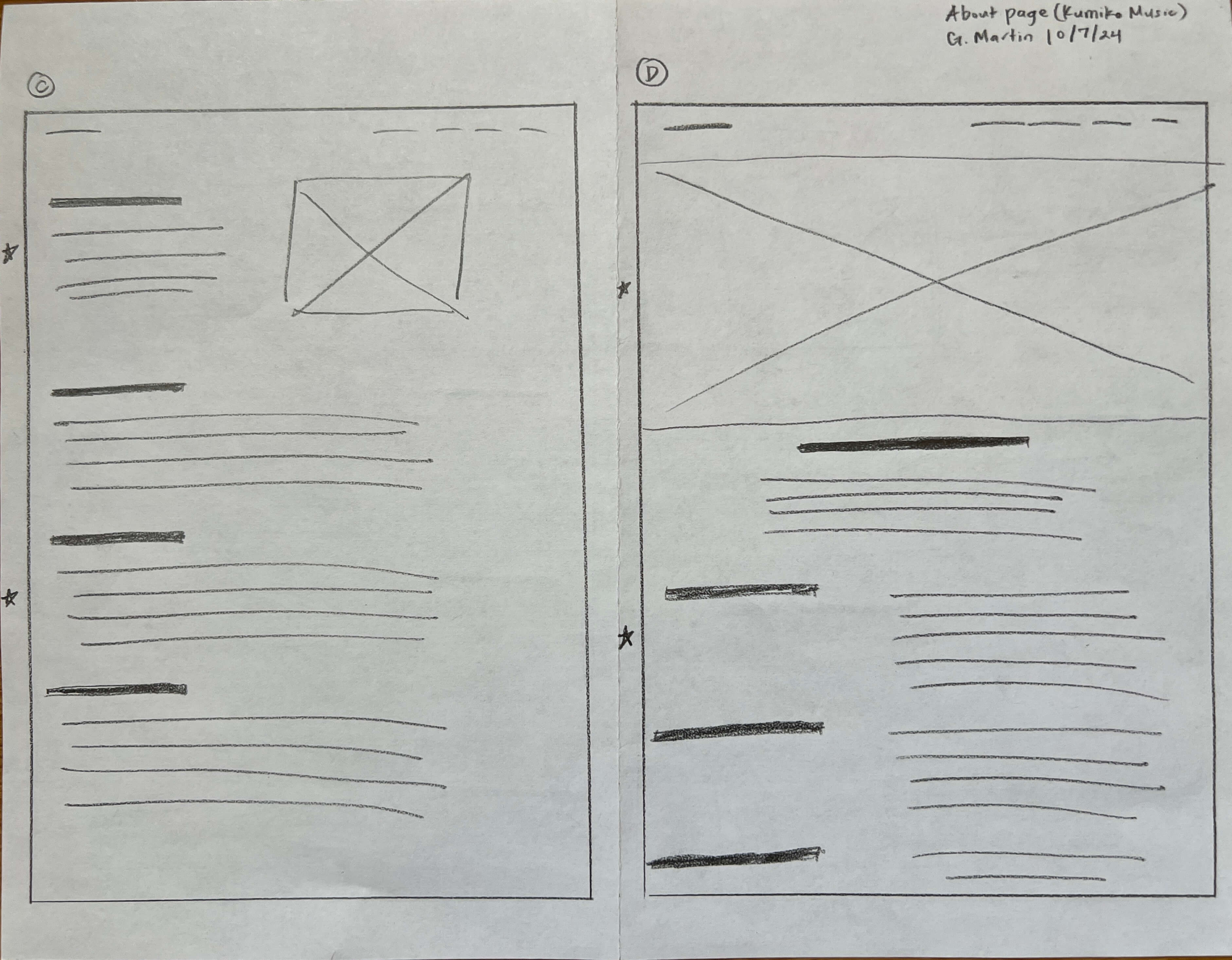
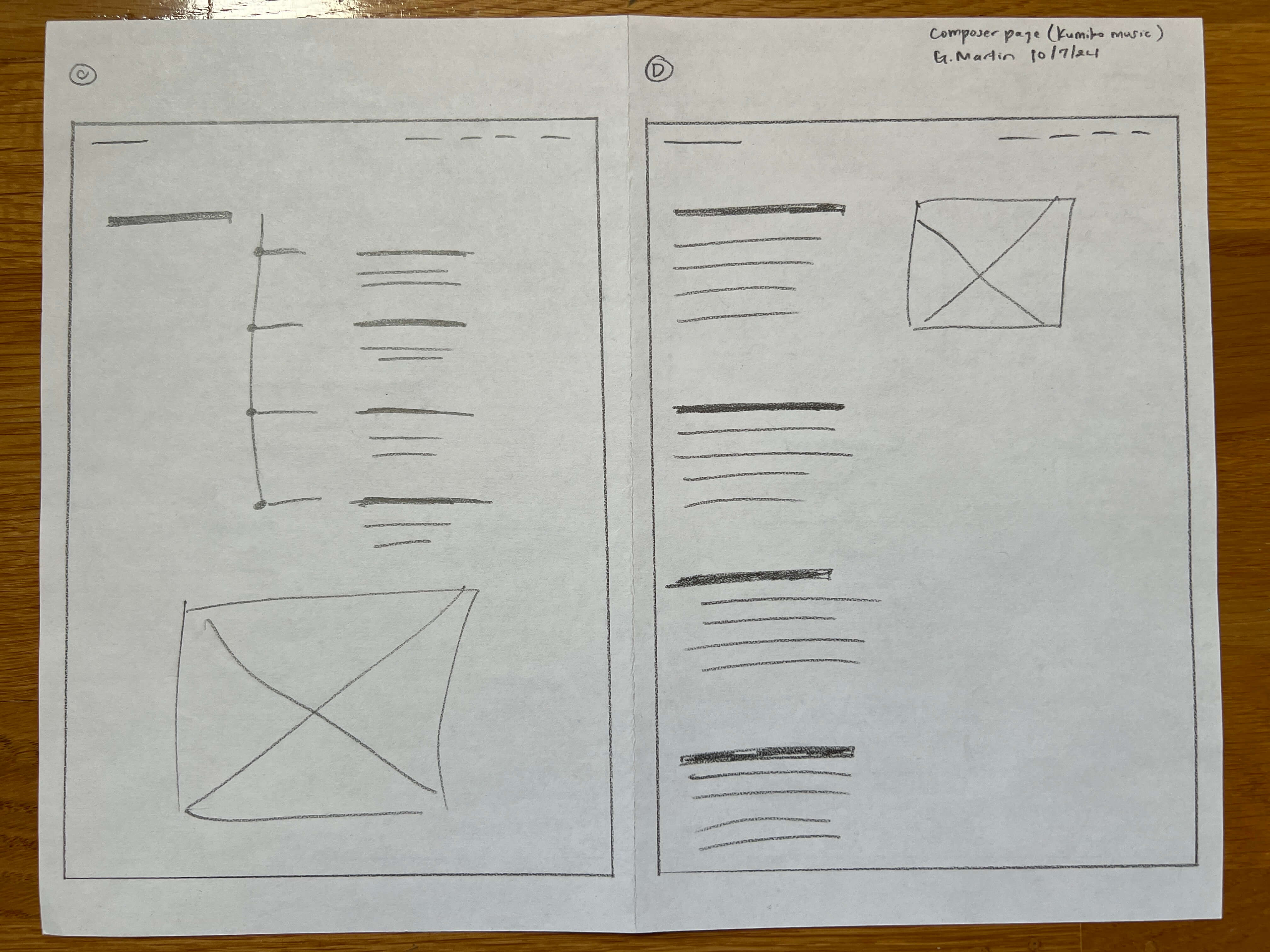
Paper wireframes
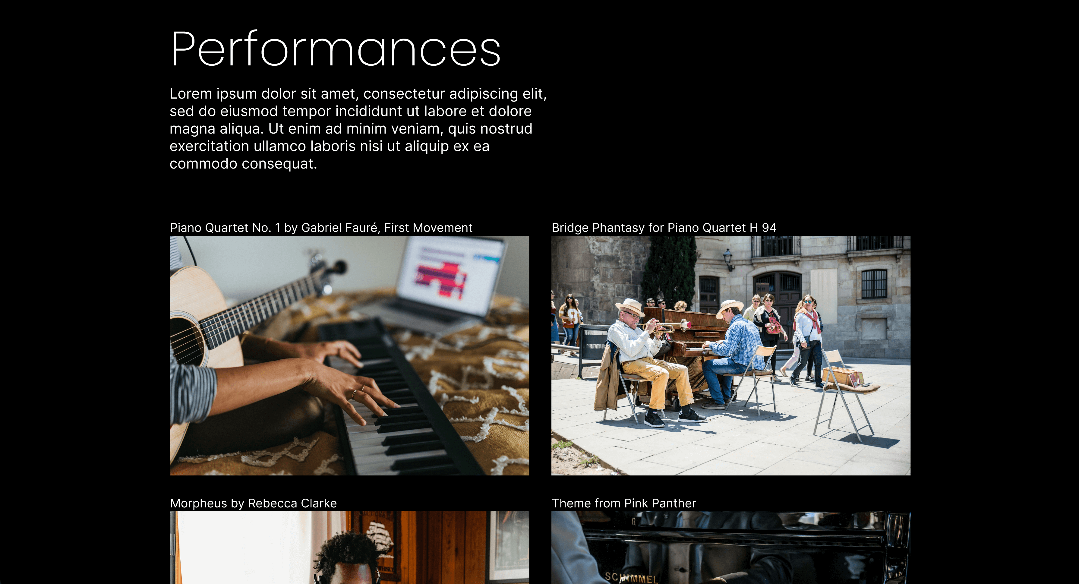
One of my goals was to layout the elements so they would be easy to find. This included using typographical hierarchy and white space.
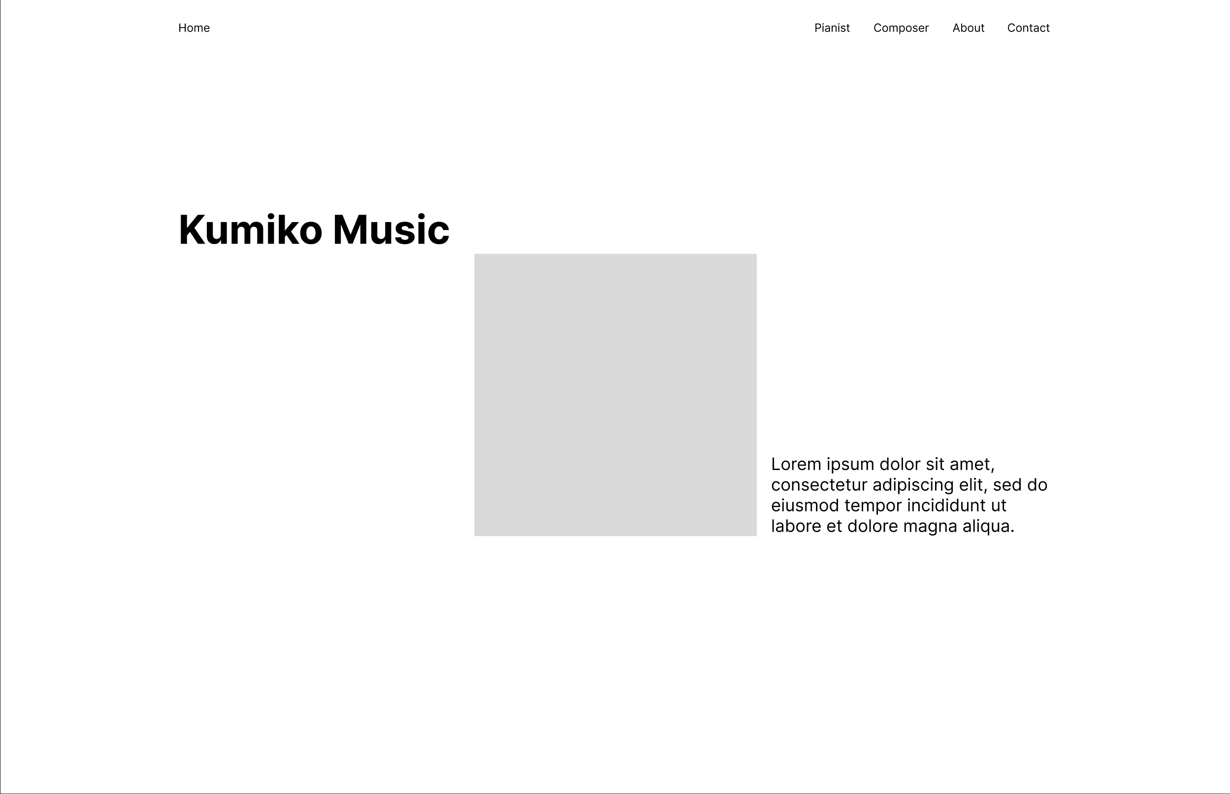
Digital wireframes
Using the paper wireframes I made, I created some lofi wireframes to better visualize what each of the pages would look like and to make sure the layouts address the pain points gathered from user research.
High-fidelity mockups and prototype
Navigation
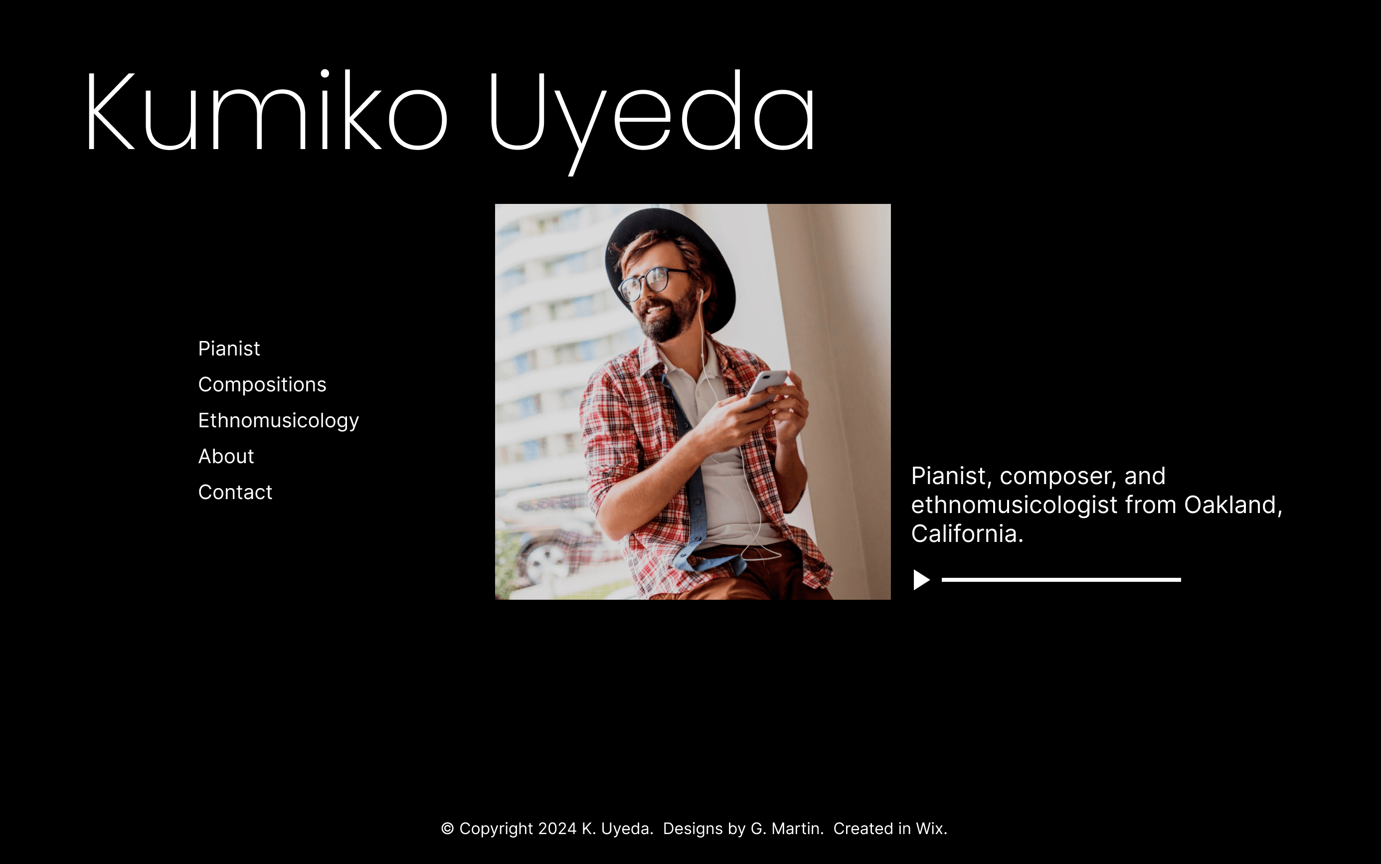
I added a navbar at the top of each page so users can easily navigate through the site.
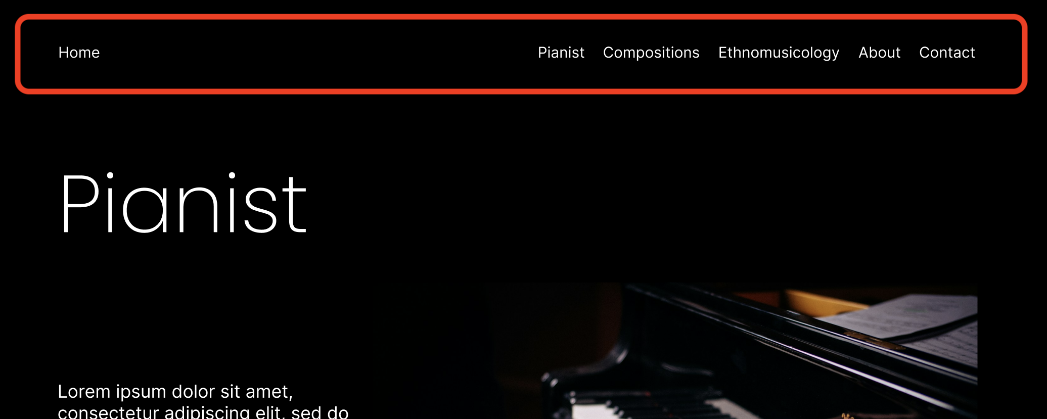
Design and layout
Each page had a different layout. Elements weren’t laid out uniformly. Furthermore, each page looked different; users thought that because of this, there was a lack of cohesiveness throughout the site. I laid out elements in a similar fashion for each page and used consistent font sizes. I used section headers followed by their main content, as well as white space to further designate sections on a page.
Ethnomusicology
Users found the Ethnomusicology content to be very text heavy and very hard to read. I used headers and white space to make it easier to read.

High-fidelity prototype
I created high-fidelity mockups and a high-fidelity prototype which I then tested with users to get feedback.
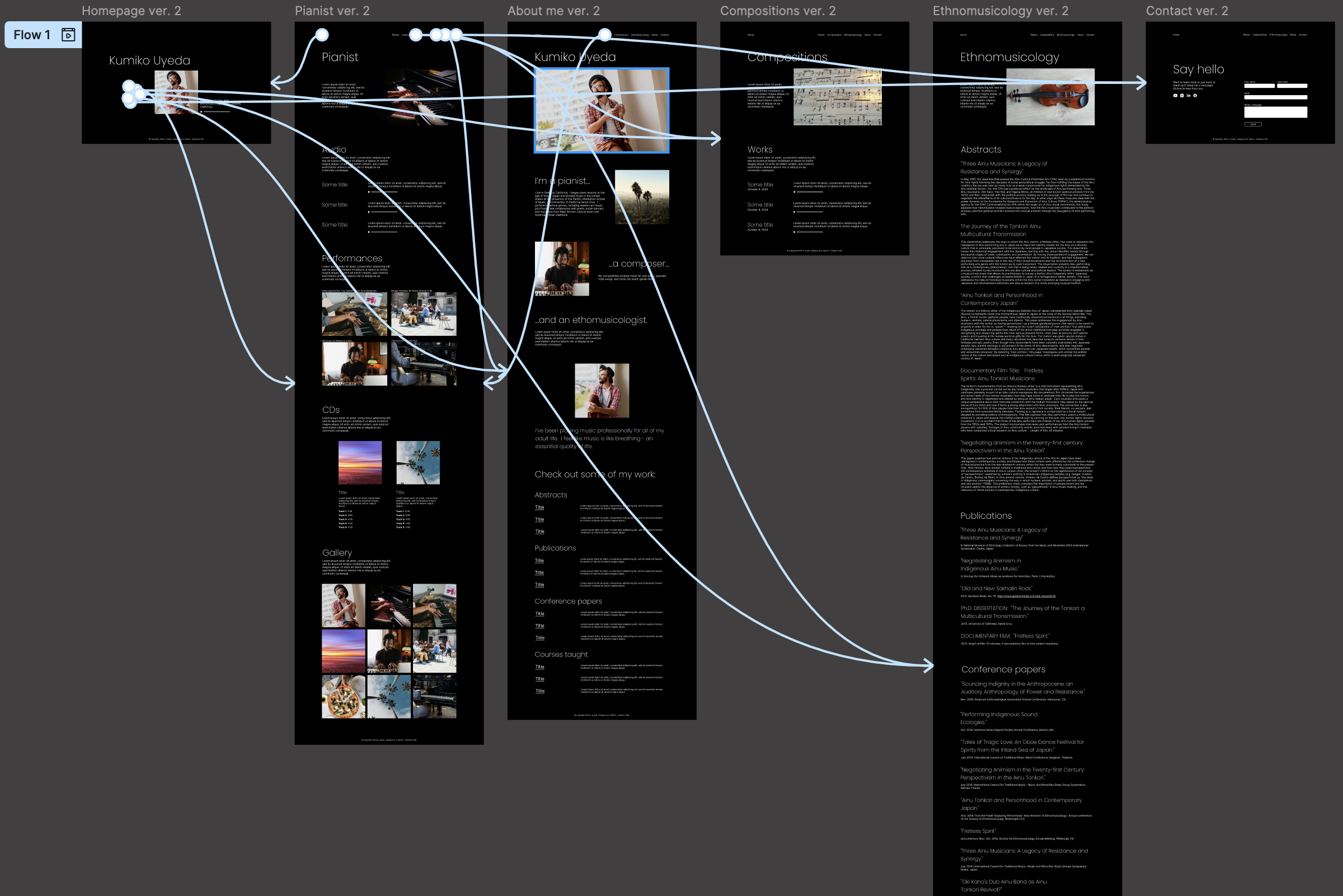

Photo by Glenn Carstens-Peters on Unsplash
Usability studies
Parameters
Using the high-fidelity prototype, I conducted a usability study to see if the new designs tackled the pain points users faced with the site’s previous design. Here are a few details of the study:
Study type
Moderated usability study
Location
United States, remote
Participants
3 participants
Length
30-45 minutes
Findings
Here were the main findings from this usability study:
Improved navigation: Participants didn’t have any trouble navigating the site and found it straightforward. Though, some thought the navbar links might be confusing.
Personal touch: Participants liked the “personal touch” the site had and wanted to learn more about what inspires her.
Uniformity: Participants liked how the information was structured and organized. Although, the Ethnomusicology page was still text heavy.
Accessibility considerations
Here are a few things I considered when creating the new design:
Contrast: The black background and white text made the site easy to read.
Readability: Adding typographical hierarchy and utilizing whitespace also made the site easier to read.
Photo by Heather Wilde on Unsplash
Moving forward
Building the site in Wix
Kumiko's site was originally built in Wix, a low-code/no-code platform for building websites. I created a template and used Wix’s gridlines and built-in features (which also influenced my designs) to create a template for Kumiko’s site, doing my best to match the designs I created in Figma.
Takeaways
Impact
Overall participants found the new site easy to navigate and straightforward. Here's what a few participants said:
“I like that there was a visual component, every aspect of Kumiko.” - Participant B
“It’s easy on the eyes, easy to read. It’s elegant looking.” - Participant C
What I learned
Throughout this project, I learned that communication is key. I made sure to understand what Kumiko was looking for and updated her regularly. I also tried to balance meeting user needs, while also meeting the stakeholder’s needs. This is my first freelance project and it pays to be organized! I utilized spreadsheets, Google Drive, and Notion to keep track of everything. Finally, I learned how to adapt my design process, given that there were budget constraints and a platform for creating sites with little or no code.
Final designs
Click the button below to see the final designs and what I worked with when building the template in Wix!
Thank you!
Phew! That was a journey wasn't it? Thank you for taking the time to go through this case study. If you’d like to learn more or want to connect with me, my email and LinkedIn are listed below: